Bringing companies and employees together
The project aimed to continue the development of platform design from the style guide and some predefined screens by the company.
The project aimed to continue the development of platform design from the style guide and some predefined screens by the company.
Firjan is a private, nonprofit organization with over 7,500 member companies. Its main objective is to promote business competitiveness, education and quality of life of industry workers, contributing to the sustainable development
of the state of Rio de Janeiro.
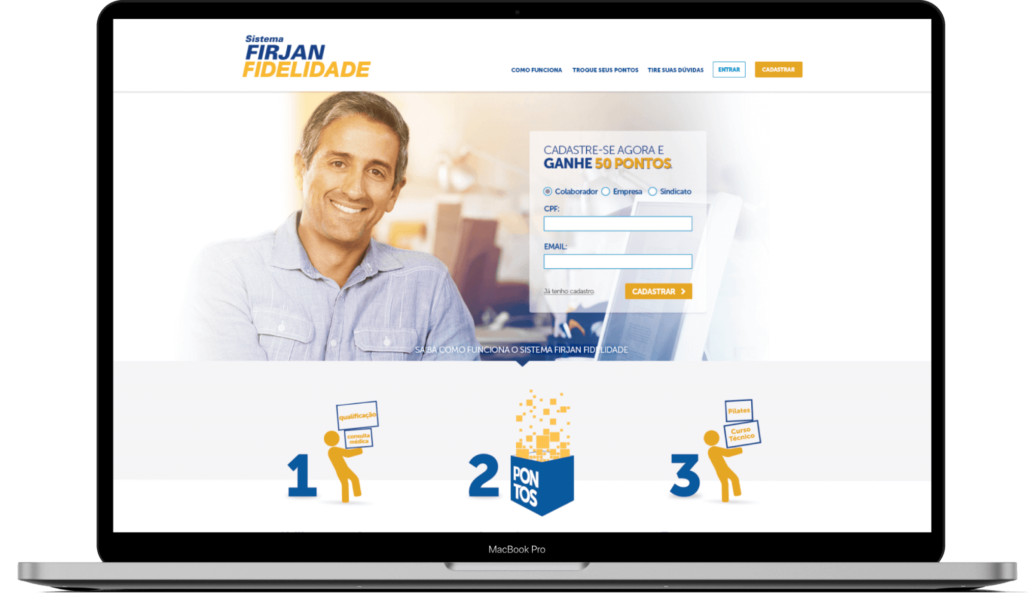
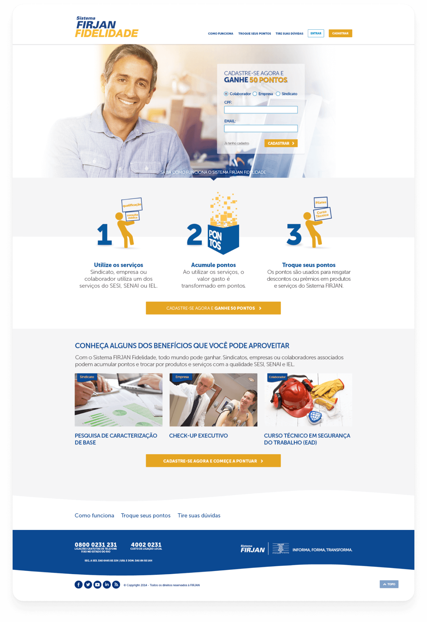
Firjan's reward program was created to strengthen the relationship between member companies and their employers, enhancing the delivery of offers and services across the state. The project
was to design and validate the best possible way to help users navigate and engage with the program through the platform.
Keep it simple
One of my goals was to make the look and feel simple as possible and also make it easy to deploy on the platform since we had a very short schedule
Engagement
Easy navigation, menus and steps to help users to keep browsing content offers. A good navigation experience is important to keep them engaged with the platform.
Consistency
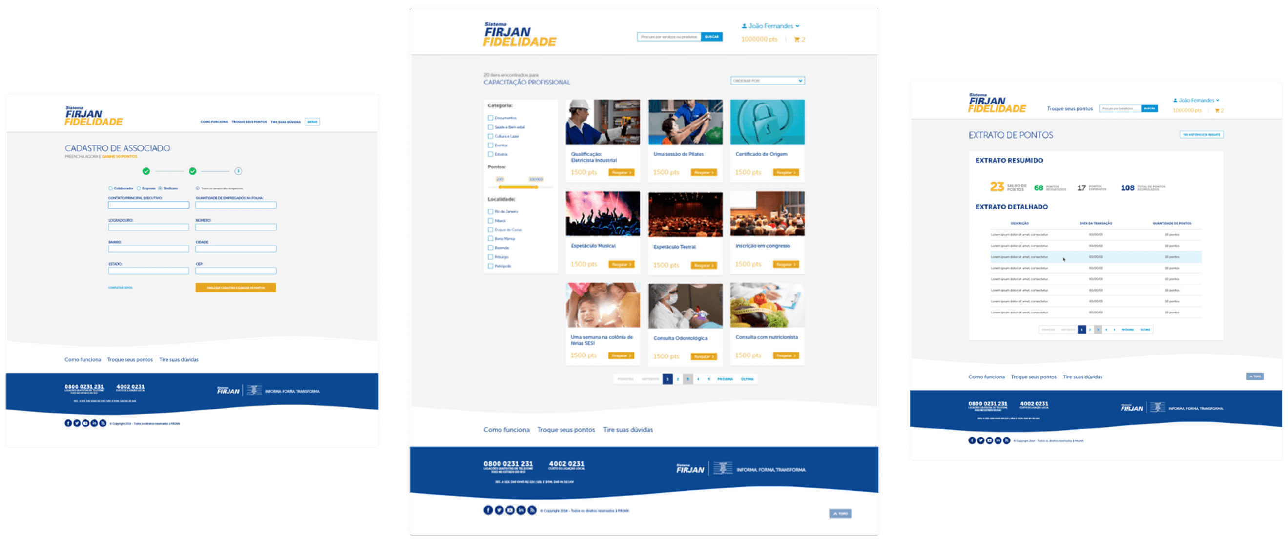
Since I joined the project, all the files have been in PSD format and not ready to scale or create new pages, which was a challenge. One of my tasks was to organize this module library based on the atomic design system and prepare a good documentation for the development team.
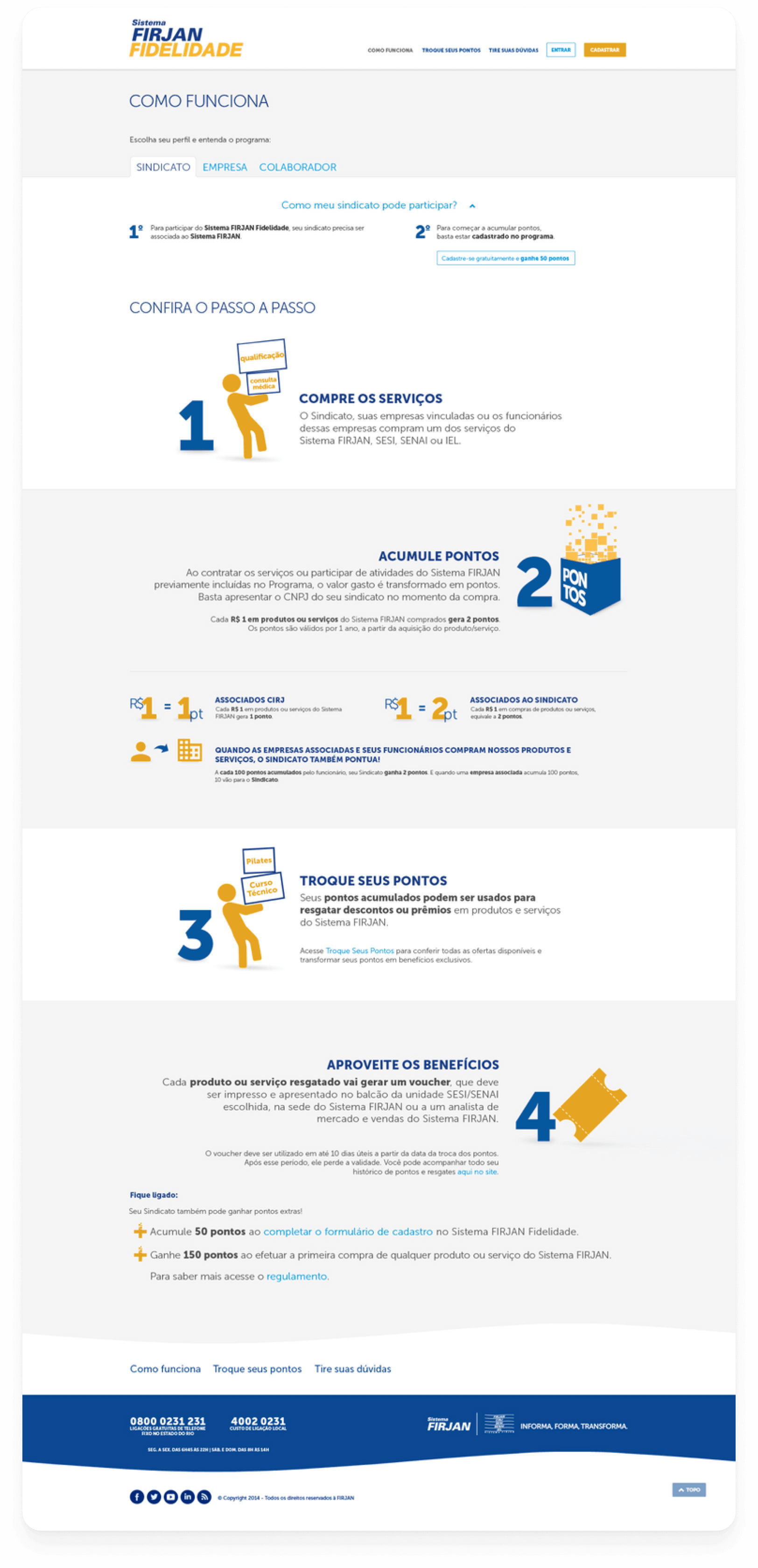
The project had a certain complexity, big volume of documentation about rules and conditions, three different types of users and each one with different conditions.
Also, I was part of the team of outsourced professionals hired
by Firjan, this factor created a certain distance and complexity in communication and validation.
The extense content volume was the main challenge of this project. I had to balance vertical scroll and space to create a
good navigation rythm and simplify the information that was hard to explain.
For all screens, the main idea was to use visual hierarchy as the differentiator factor. I've started wireframing ideas of progress steps, infographics, accordions and every UI resource could help create a good experience.
The
direction to use icons and infographics to explain the rules was very positive, this caused to break the content to a good reading flow.
Store main screens
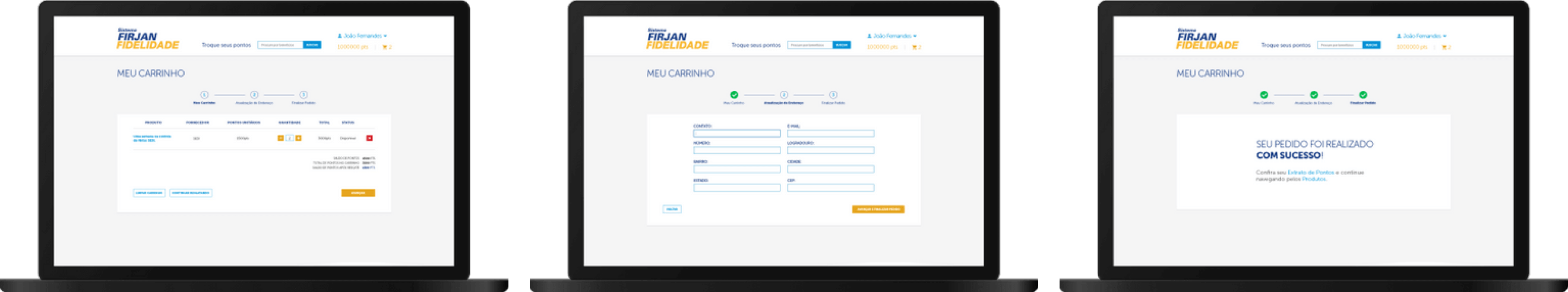
Checkout screen flow
Information architecture and content planning can be a good exercise for seeing how users find content on a site or platform and helping them with this task. I was not invited to participate in this part of the project, it was already a closed content scope, but there was an explicit need to further explore this phase.
Thinking about this, one thing I could have done differently was to explore more different screens for each type of user, they could provide different ideas and help test components to check what works and how to get better results
in the future.
© Copyright 2020. Dina Jumann.